
k&k's


Direction
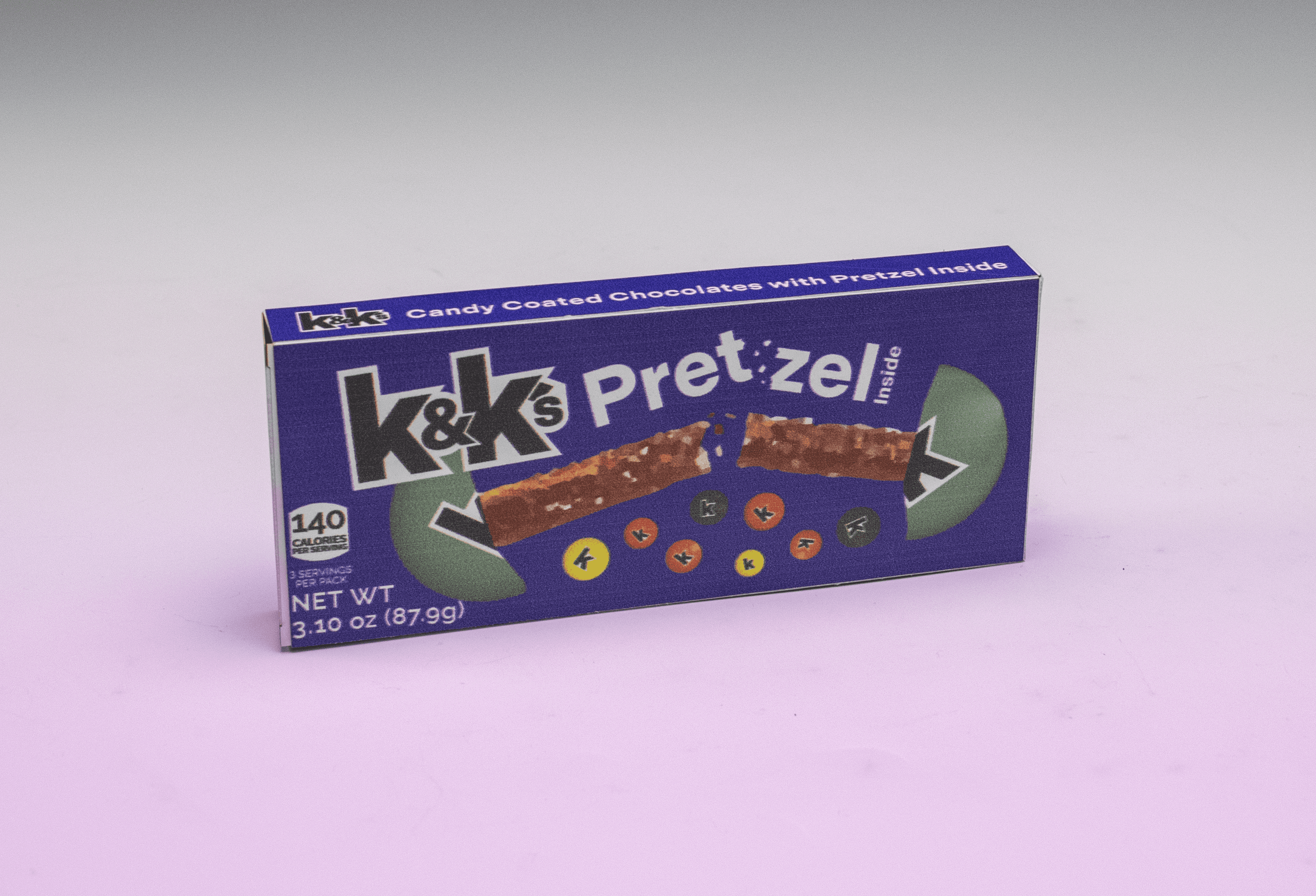
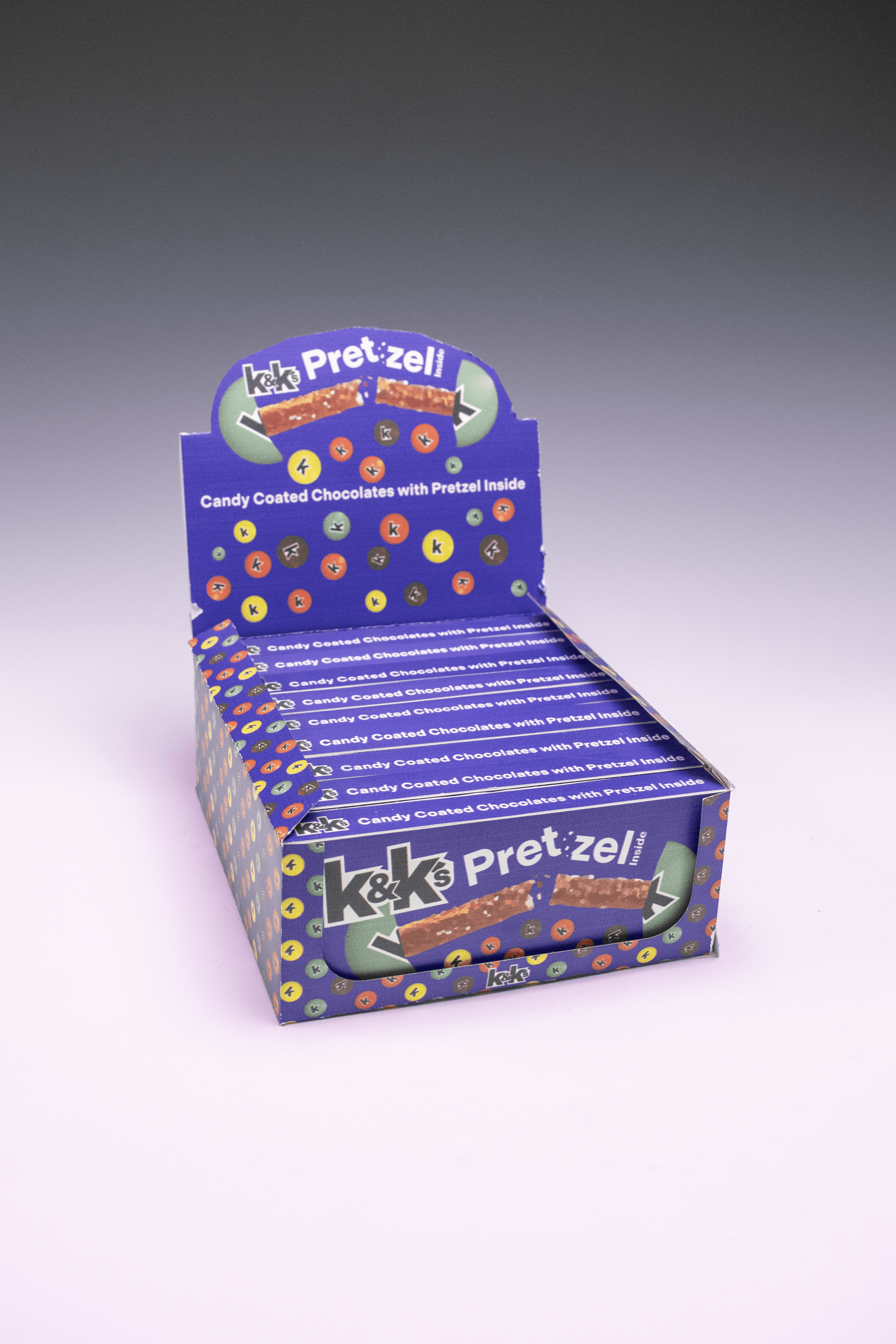
Rebranding a popular product and reimagining its packaging required an extensive and multifaceted approach. Playfulness, coordinated colors, and a celebration of unique flavors formed the core of the new brand direction. With adults as the primary target audience, the visual identity combines bold color choices, sleek typography, and suggestive language to create a more mature brand presence.
Process
Typography plays a central role in brand expression, making font selection vital to establishing the desired voice. Indivisible Bold was chosen for the logotype because of its sharp ampersand, strength, and contemporary feel. Raleway serves as the primary typeface, prized for its versatility across multiple weights and its modern, straightforward appearance.
Deliverables
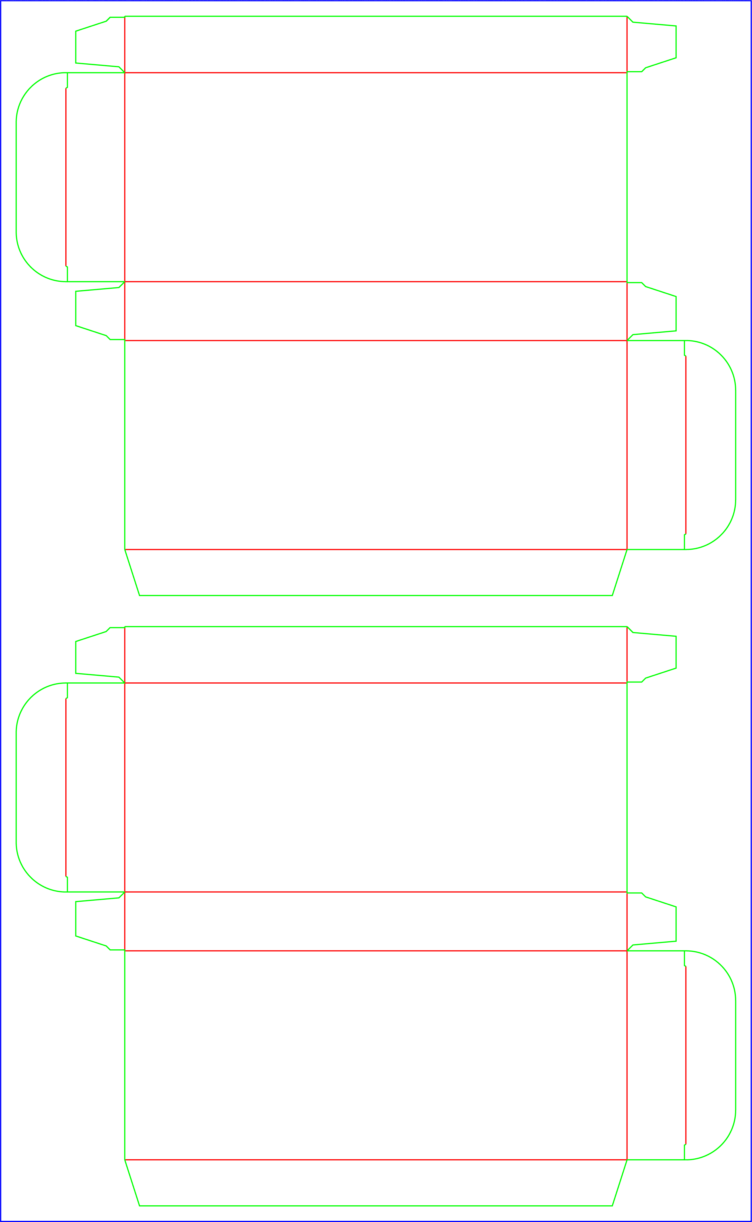
This project generated deliverables spanning a range of media. The process began with the brand redesign, corresponding identity elements, and packaging concepts. Development of print files for laser printing required only minor testing to perfect small details, such as locking flap mechanics. Production and assembly of the point of purchase box and product packaging underwent several iterations to optimize color accuracy and element sizing.