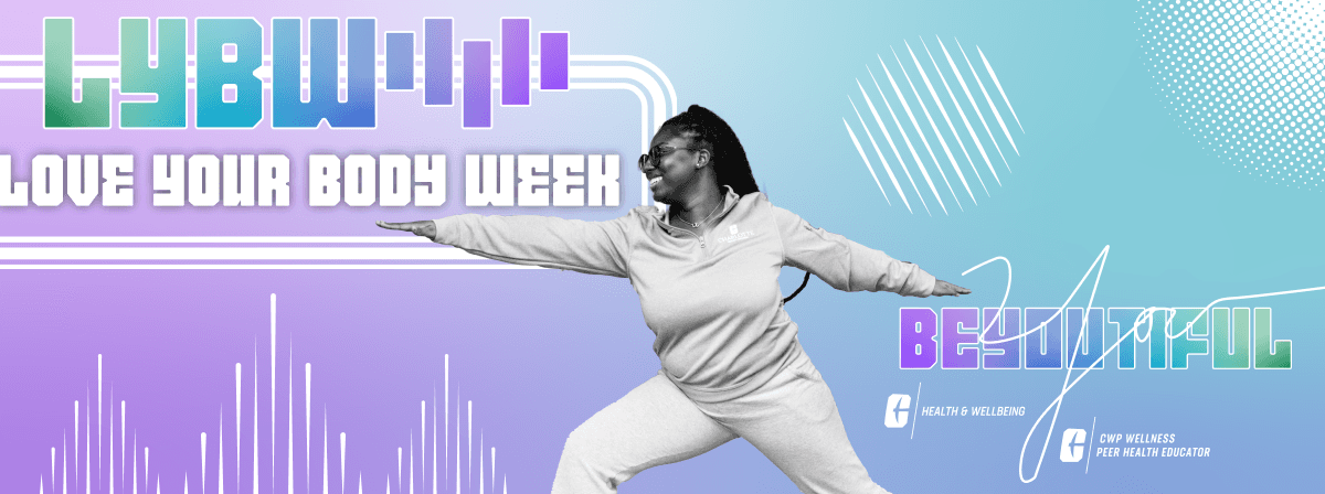
Love Your Body Week
Type
Body Positivity Initiative Week
Role
Art Direction | Campaign Design
Client
University Recreation | UNC Charlotte
Timeline
Jan 2924
—
Feb 2024
Type
Body Positivity Initiative Week
Client
University Recreation | UNC Charlotte
Role
Art Direction | Campaign Design
Timeline
Jan 2924
—
Feb 2024
Case summary
Love Your Body Week translates a campus wellness initiative into a visual campaign system, using art direction, print pieces, and digital assets to make the week feel approachable, expressive, and easy to recognize.
Promoting Positive Body Image and Overall Wellbeing
UNC Charlotte Health and Wellbeing Unit celebrated NHSDA Love Your Body Week February 19 to 23, 2024. Throughout the week the Center for Wellness Promotion with University Recreation hosted multiple events.
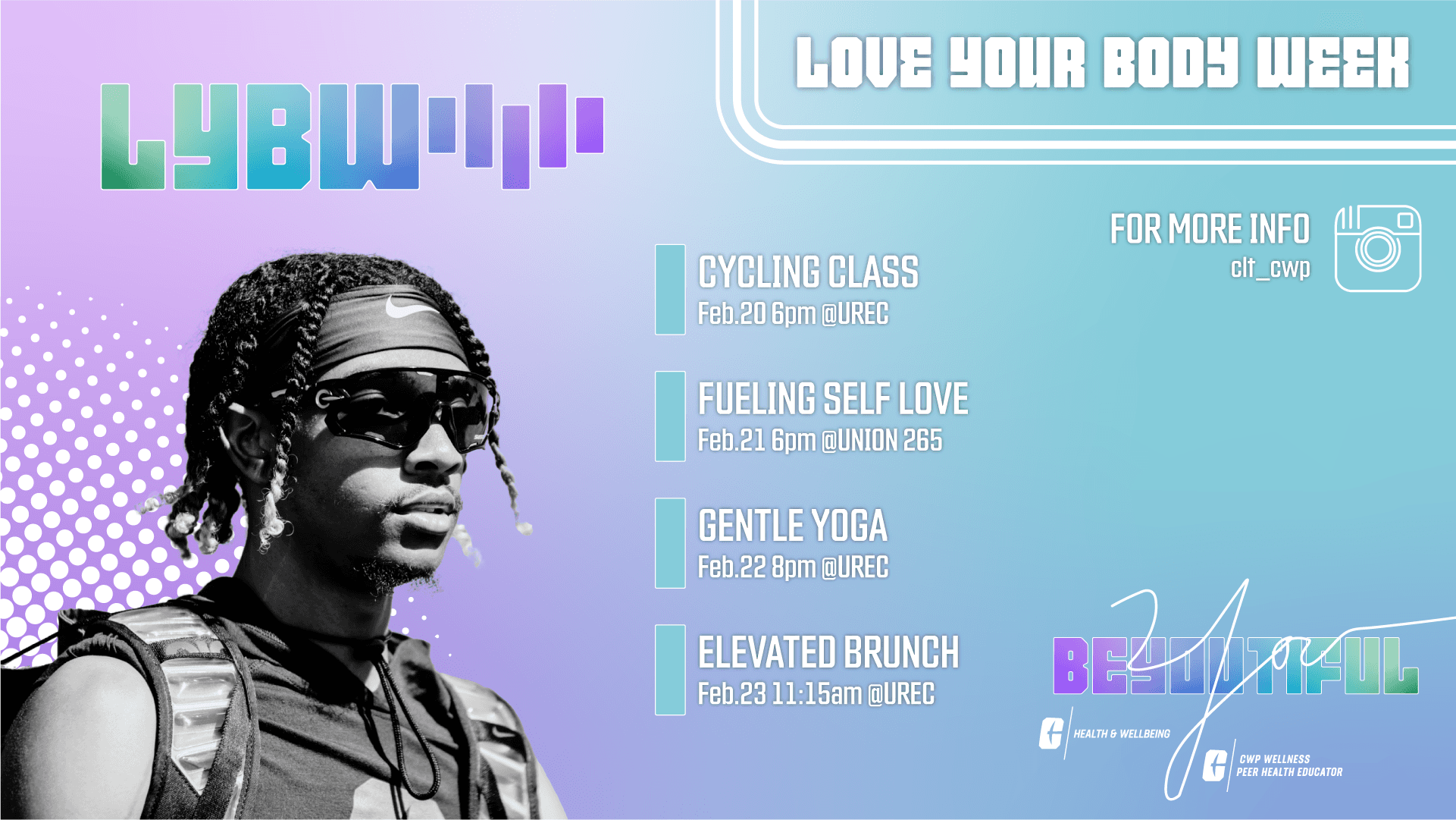
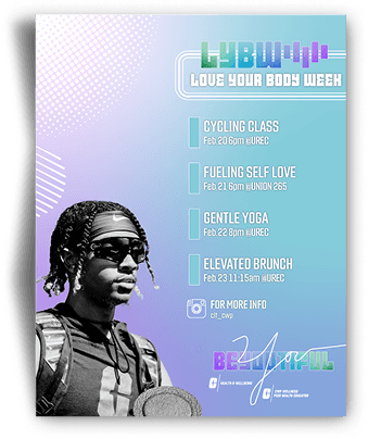
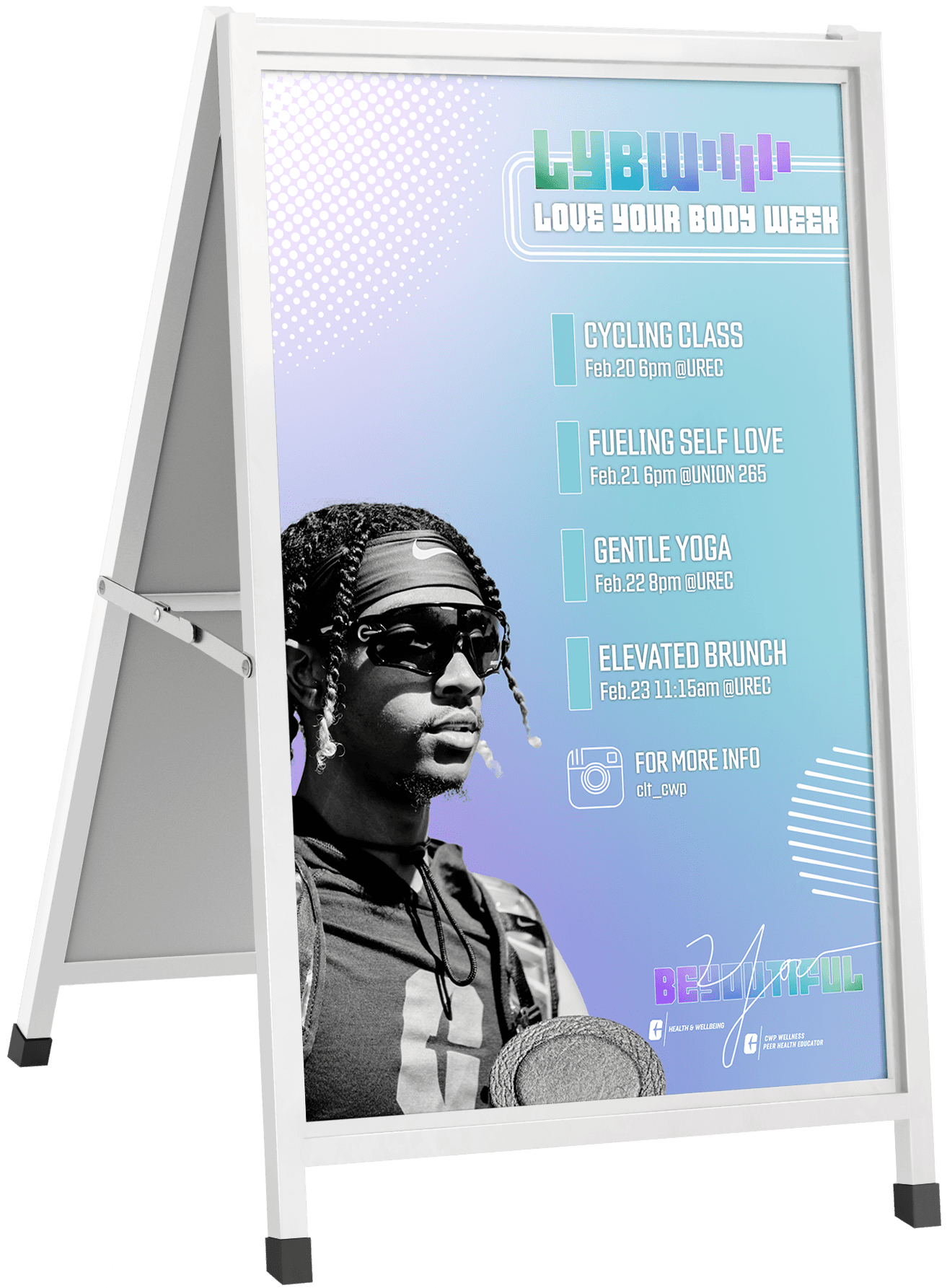
Print & Digital
This campaign utilized both physical and digital assets to promote the week introducing more complexity in constraints like color and budget.
Formats
Schedule
Dynamic Days
The Week
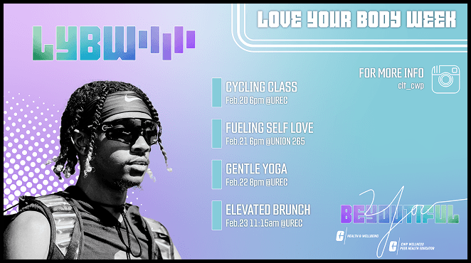
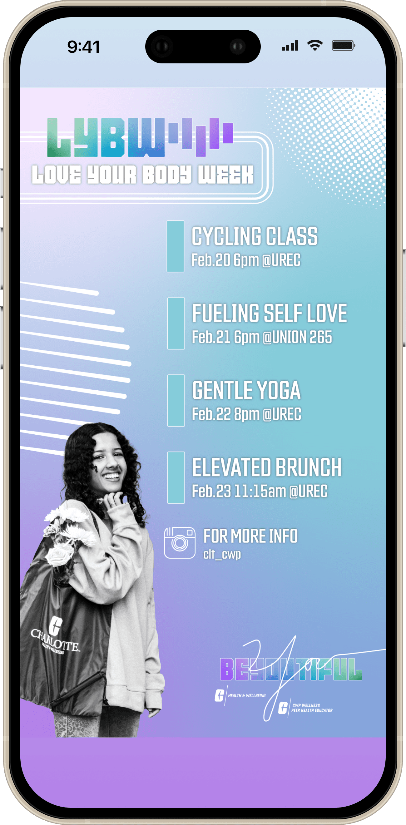
Schedule
Informing the student body through Instagram Stories of the exciting events this week
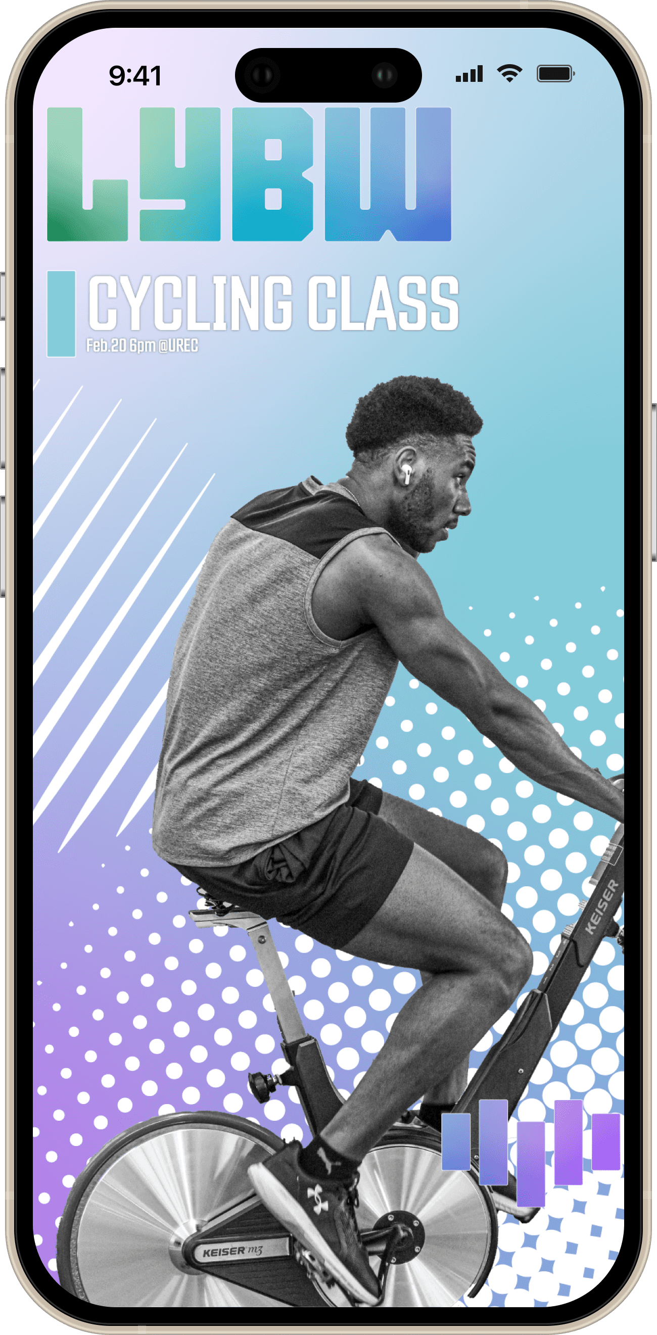
Tuesday
Cycling Class
Low barrier for entry exercise class to promote easy and fun physical activity
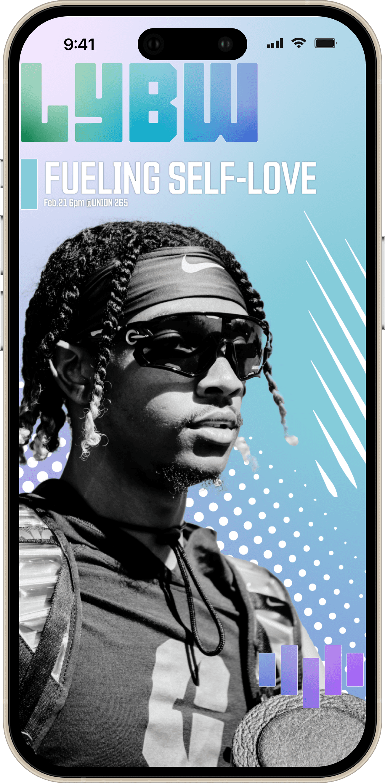
Wednesday
Fueling Self-Love
Seminar highlighting body positivity
Thursday
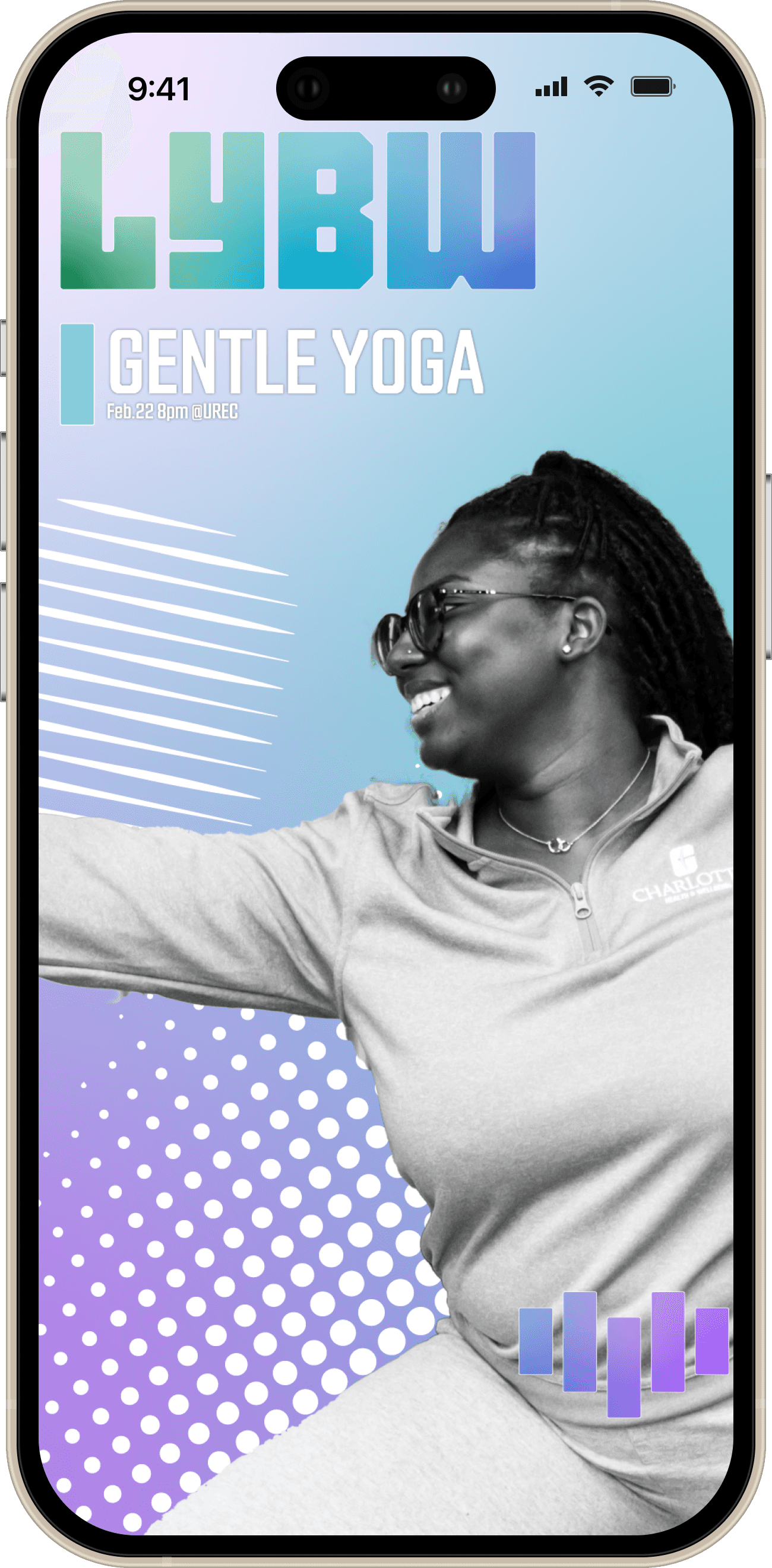
Gentle Yoga
A guided class through gentle flows, emphasizing deep stretches and relaxation
Friday
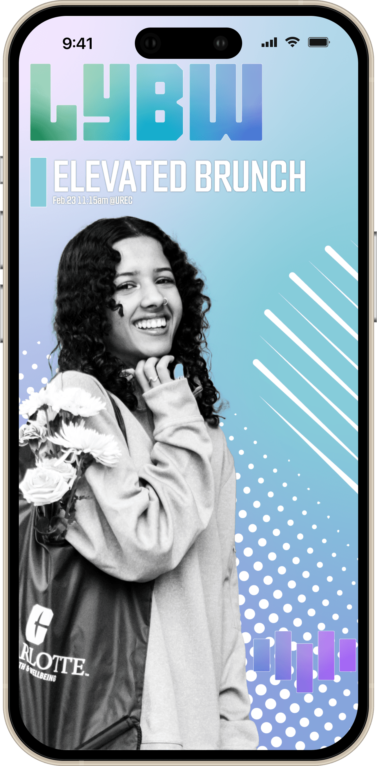
Elevated Brunch
Interactive demo to showcase healthier alternatives to sugary morning meals
Promoting Positive Body Image and Overall Wellbeing
UNC Charlotte Health and Wellbeing Unit celebrated NHSDA Love Your Body Week February 19 to 23, 2024. Throughout the week the Center for Wellness Promotion with University Recreation hosted multiple events.
Print & Digital
This campaign utilized both physical and digital assets to promote the week introducing more complexity in constraints like color and budget.
Formats
Schedule
Dynamic Days
The Week
Schedule
Informing the student body through Instagram Stories of the exciting events this week
Tuesday
Cycling Class
Low barrier for entry exercise class to promote easy and fun physical activity
Wednesday
Fueling Self-Love
Seminar highlighting body positivity
Thursday
Gentle Yoga
A guided class through gentle flows, emphasizing deep stretches and relaxation
Friday
Elevated Brunch
Interactive demo to showcase healthier alternatives to sugary morning meals