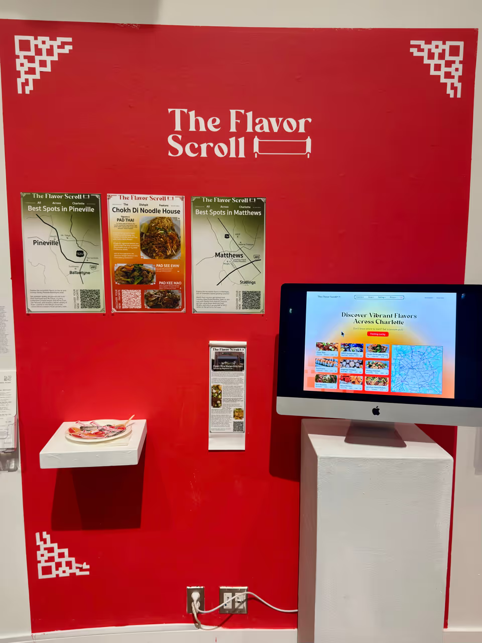
The Flavor Scroll
Designed from Aug to Nov 2025 for Graphic Design Projects at the University of North Carolina at Charlotte
More Than a Meal
The importance of advertising goes beyond business growth. It also promotes their culture and cuisine. Helping people understand these new flavors lets them better appreciate the richness and history.The purpose of The Flavor Scroll is to help restaurant owners easily come into the digital era, showcase their community integration, and educate people. These efforts promote business and build lasting relationships, turning visitors into regulars.
Product 1
In the 21st Century
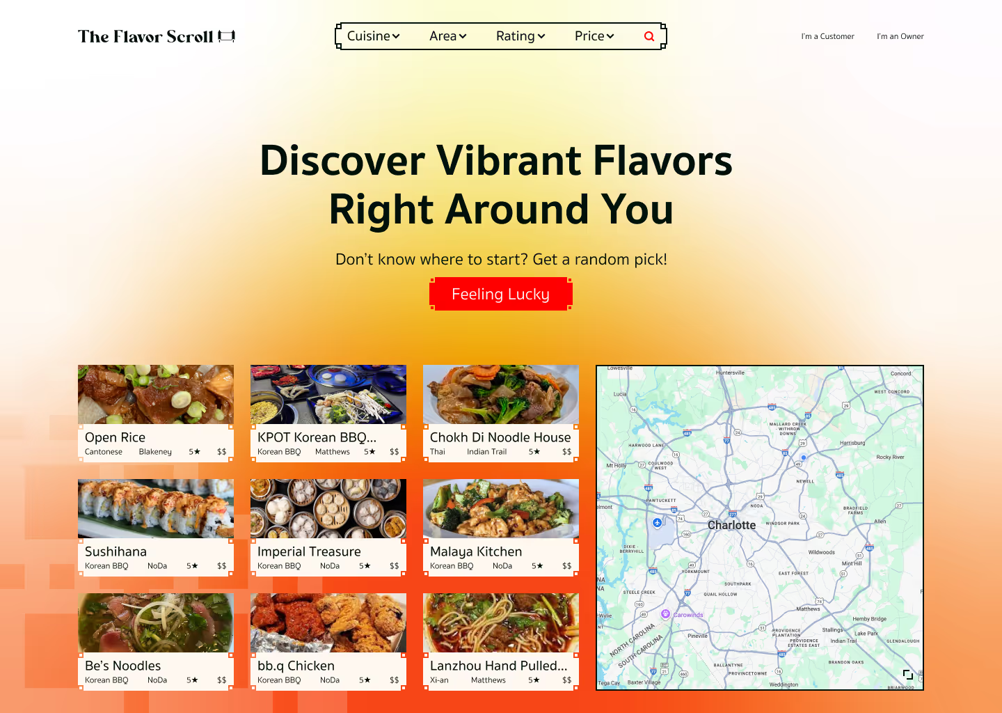
Developing a digital hub for restaurant owners to boost discoverability.
Product 2
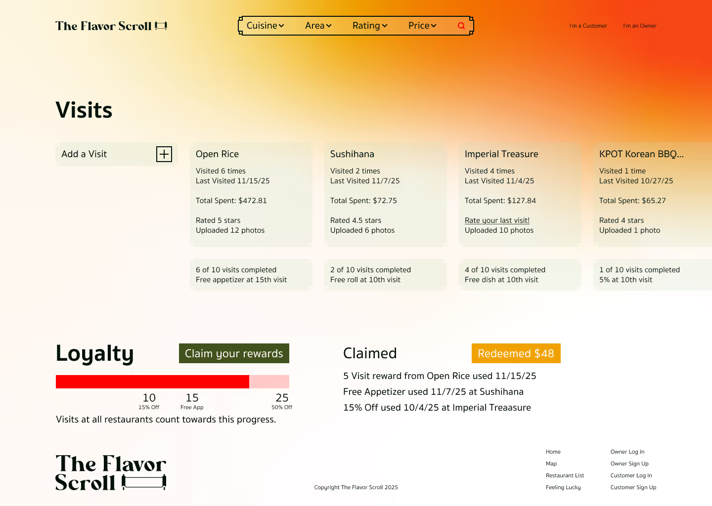
Loyalty Rewarded
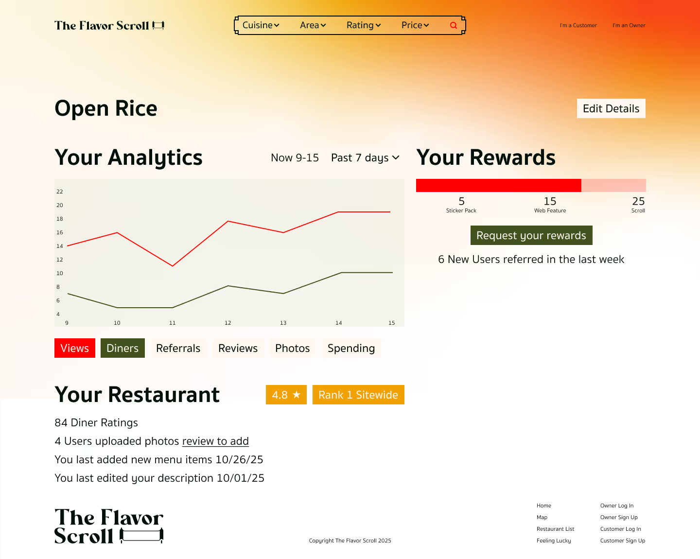
Creating a system for owners and patrons to incentivize engagement.



Product 3
In Real Life
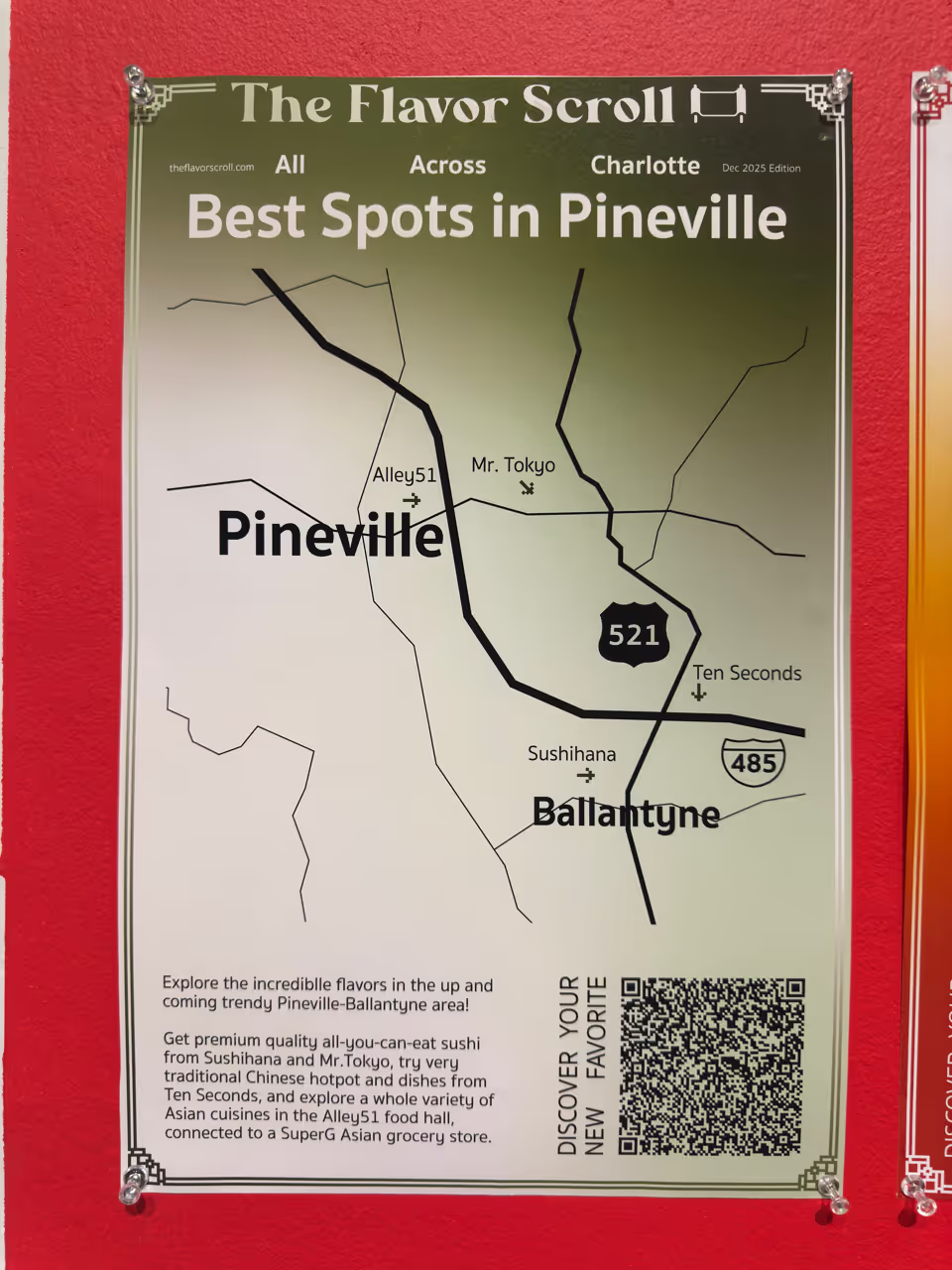
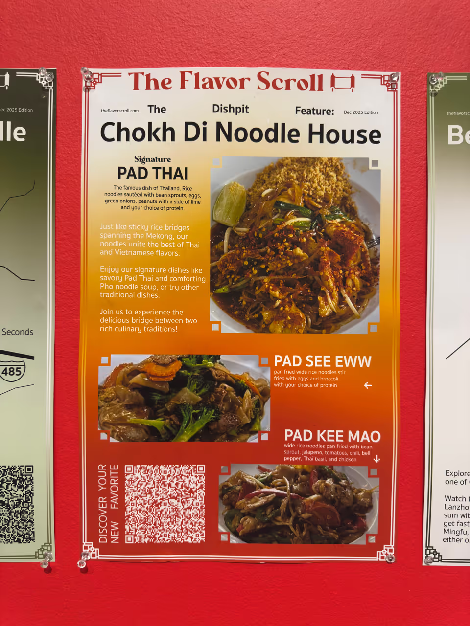
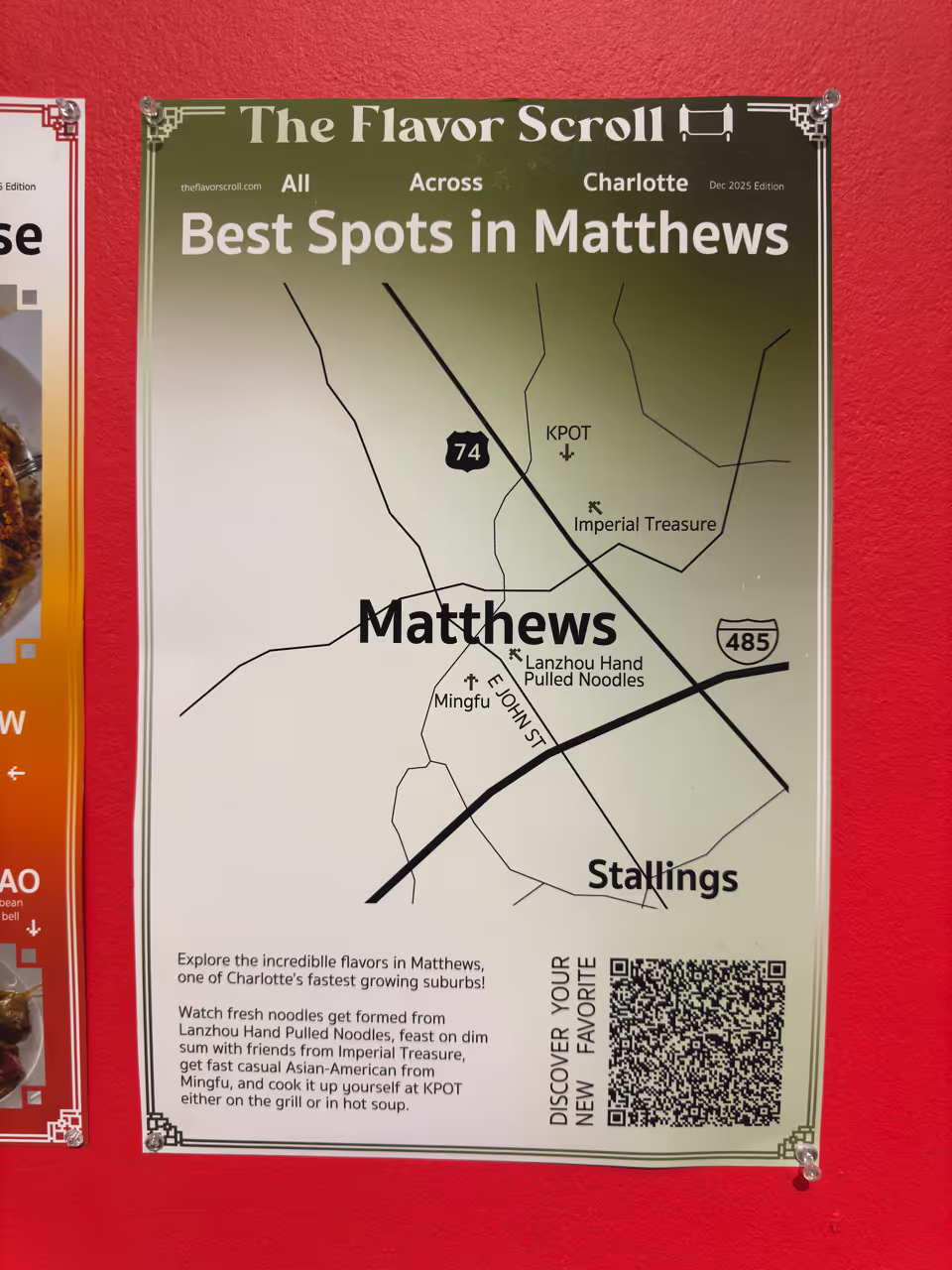
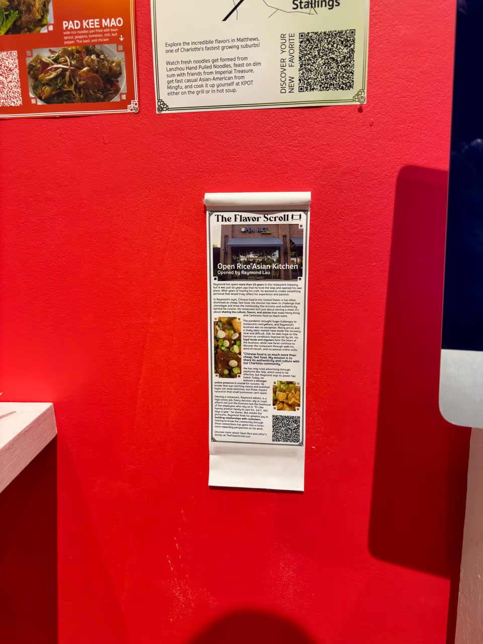
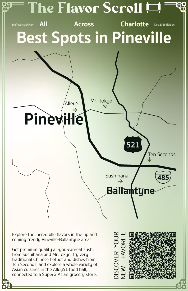
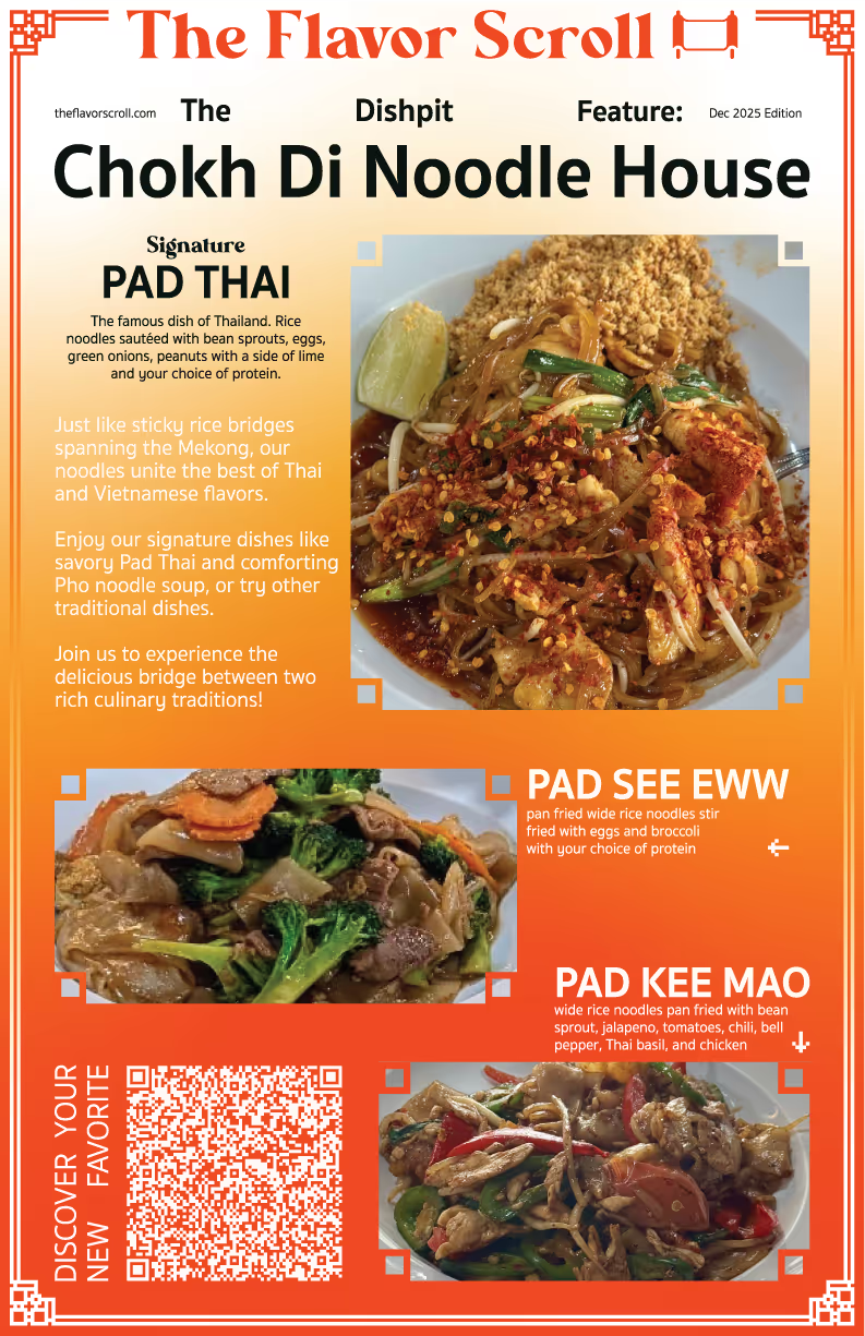
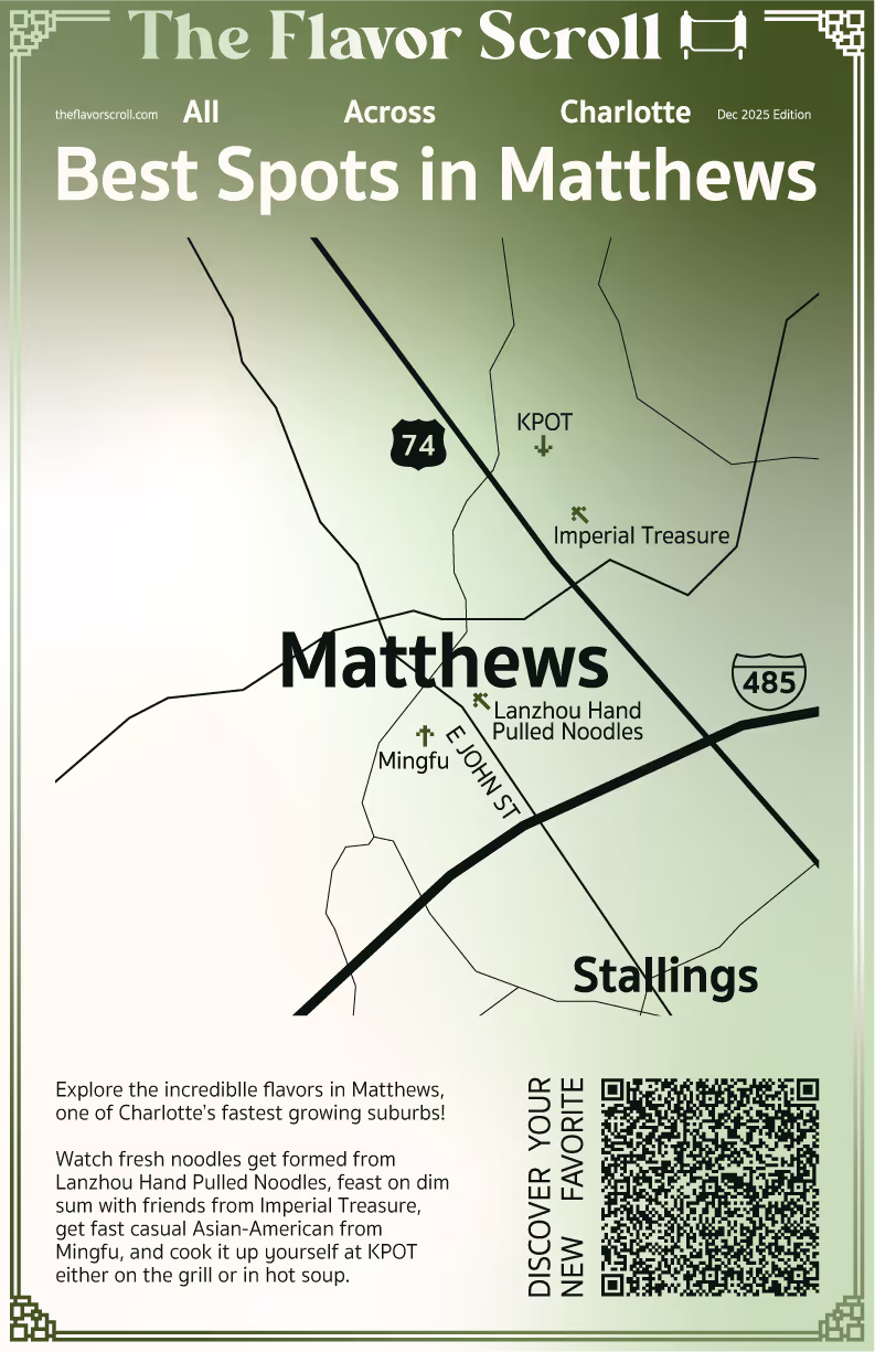
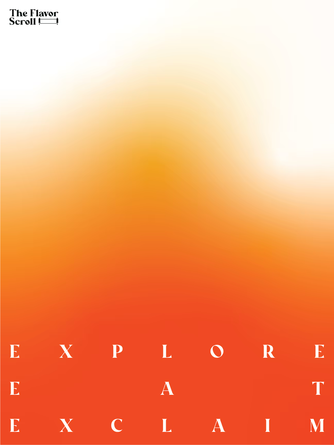
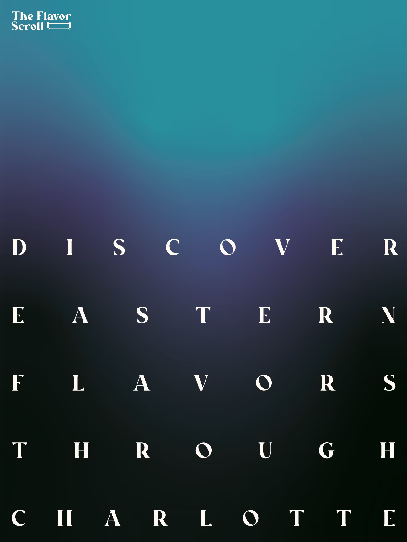
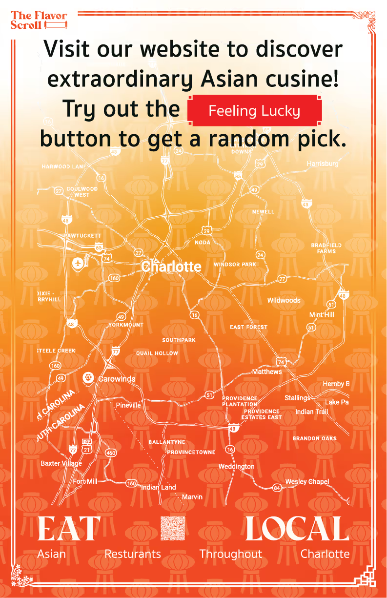
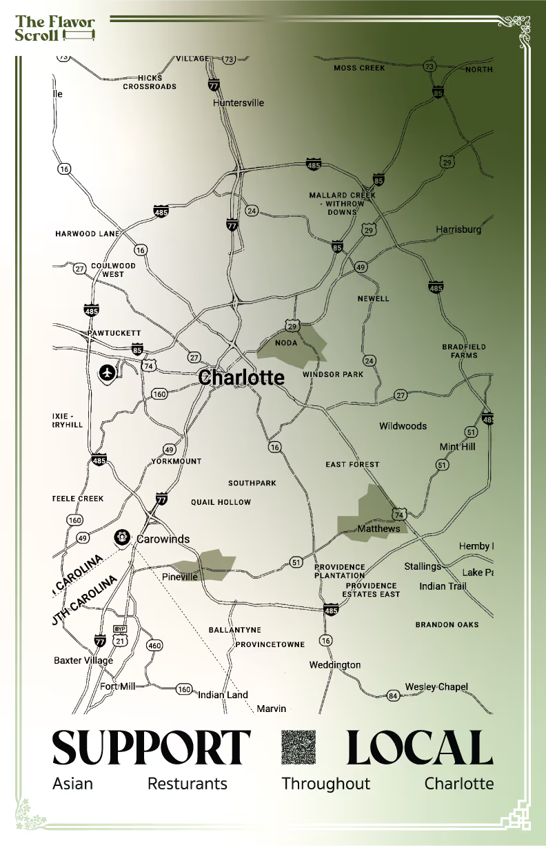
A specialized poster series to promote neighborhoods and specific restaurants.
Direction
For the brand’s design, common Asian colors were chosen, such as China’s red and yellow, and a modern hue like matcha green to make the brand easily recognizable to a broader audience. The fonts are eye-catching, decorative, and legible, balancing modernism and a sense of tradition. Food imagery is a major focal point, designed to start appetites.
Sinerva
Aa Bb Cc Dd Ee Ff Gg Hh Ii
Jj Kk Ll Mm Nn Oo Pp Qq Rr
Ss Tt Uu Vv Ww Xx Yy Zz
0 1 2 3 4 5 6 7 8 9
. , : ! ? @ # $ & ( ) -
Sukhumvit Set Bold
Aa Bb Cc Dd Ee Ff Gg Hh Ii
Jj Kk Ll Mm Nn Oo Pp Qq Rr
Ss Tt Uu Vv Ww Xx Yy Zz
0 1 2 3 4 5 6 7 8 9
. , : ! ? @ # $ & ( ) -
Process
This project started in January with deep research into local communities, figuring out which one to promote and serve. Then in the fall, production started for the identity and supporting products. The message and purpose of the brand was further refined down too.
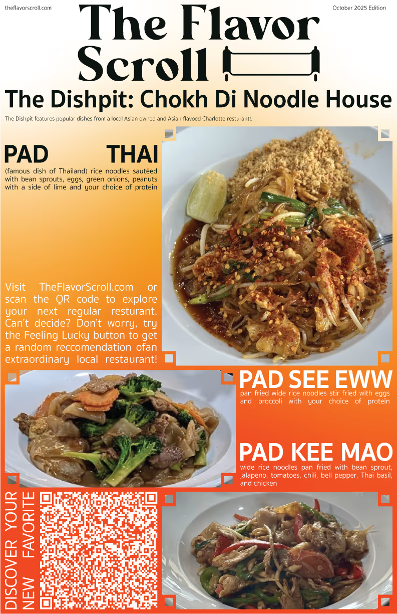
Deliverables
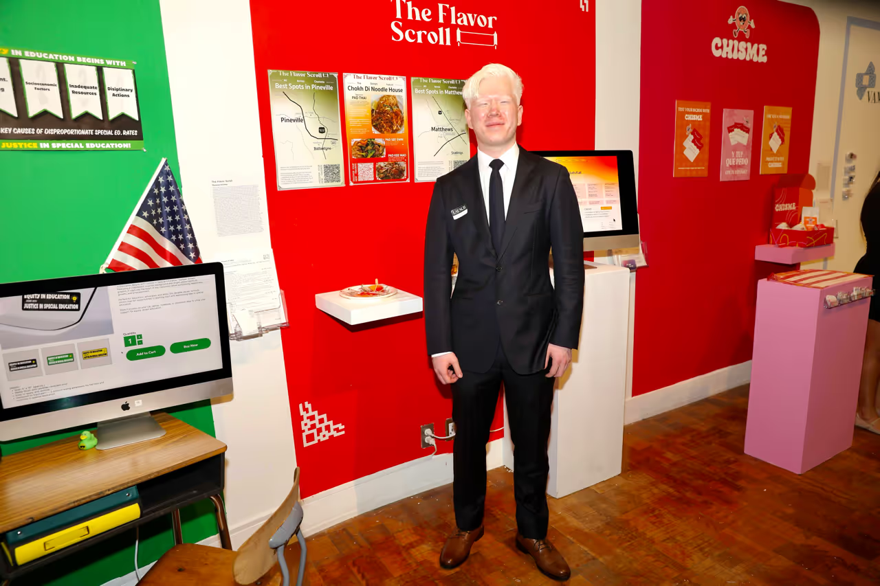
The final deliverables were a complete conceptual brand identity, 3 distinct products to support the mission of the brand, and a final exhibition showcase to present the idea to the public.
