Case summary
OperationsHERO reframes a niche B2B software concept through brand identity, advertising, and campaign design, making the product feel more memorable, practical, and easier to explain.
OperationsHERO is a naturally niche product. As a B2B software product, the user base is lower. Sales take sessions to complete and the marketing is usually by word of mouth rather than traditional ads.
Evolution
Targeting more demographics than just school officials and maintenance techs, not necessarily for sales but for exposure, ideas. and interest.
Audience
A dip into the advertising space through flyers and social media brings in a younger audience. Ads in schools allow the students to see more behind the scenes of the people that serve them daily.
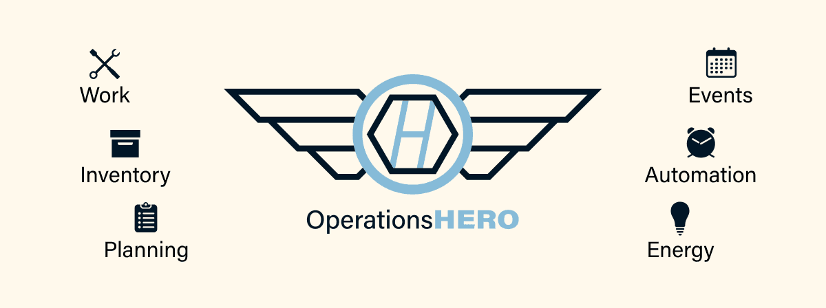
Wings
OperationsHERO is a naturally niche product. As a B2B software product, the user base is lower. Sales take sessions to complete and the marketing is usually by word of mouth rather than traditional ads.
Wrench
OperationsHERO is a naturally niche product. As a B2B software product, the user base is lower. Sales take sessions to complete and the marketing is usually by word of mouth rather than traditional ads.
O-H
OperationsHERO is a naturally niche product. As a B2B software product, the user base is lower. Sales take sessions to complete and the marketing is usually by word of mouth rather than traditional ads.
Advertising
Poster & Post
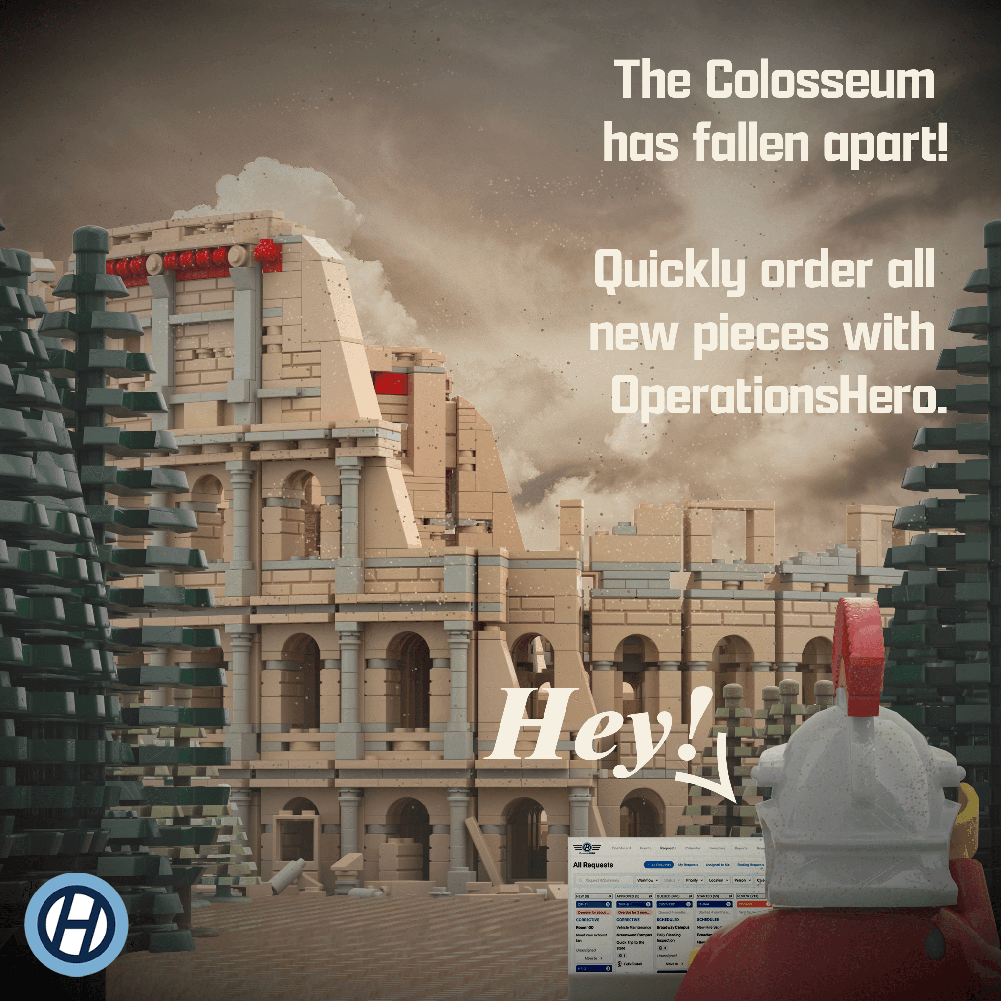
Constructing an advertising campaign for school children and administrators requires balancing broad appeal with specific audience needs. LEGO, a timeless brand enjoyed across generations, connects to a mass market. The campaign references early 2000s LEGO commercials, with contemporary copywriting inspired by those ads. The LEGO Colosseum set, known for its history of earthquake damage and required repairs, is cleverly tied to the featured maintenance services of OperationsHERO. This pairing of playful and relevant advertisement themes engages children while addressing the practical interests of adults.

Packaging
Mailer Box & Gift
A custom gift and packaging solution was developed to express appreciation to clients. The fully branded box, UV mapped inside and out, accompanied a branded hard hat designed for maintenance workers.


