OperationsHERO
Designed from Aug to Nov 2024 for Communications Design at the University of North Carolina at Charlotte
Problem
OperationsHERO is a naturally niche product. As a B2B software product, the user base is lower. Sales take sessions to complete and the marketing is usually by word of mouth rather than traditional ads.
Evolution
Targeting more demographics than just school officials and maintenance techs, not necessarily for sales but for exposure, ideas. and interest.
Audience

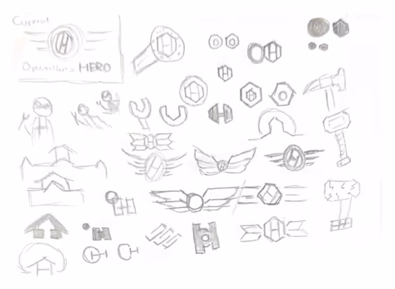
Wings
NC, the birthplace of the future. Refreshing the current logo’s symbolism. Six sections correspond to the the core features.

Wrench
The head of a socket wrench. Call to industrial nature of the users.

O-H
A subtle inclusion of the initials. Refreshing the current logo’s integration.


What
Create computerized maintenance management systems for schools.
Who
Pioneers in CMMS with an average of 25 years of experience.
When
Founded in the early 1990s. Launched OperationsHERO in 2021.


Where
Founded in the Cary/Raleigh area with remote workers all over.
Why
Create a safe, efficient, and inspiring space for the growth of the future generation.
How
Equipping maintenance technicians with bleeding edge tools to provide the best service.


Advertising
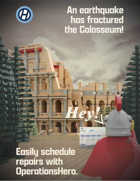
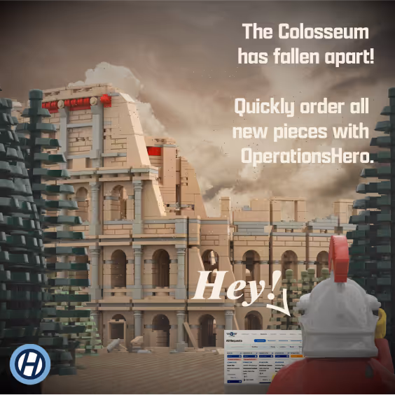
Poster & Post
Constructing an advertising campaign for school children and administrators requires balancing broad appeal with specific audience needs. LEGO, a timeless brand enjoyed across generations, connects to a mass market. The campaign references early 2000s LEGO commercials, with contemporary copywriting inspired by those ads. The LEGO Colosseum set, known for its history of earthquake damage and required repairs, is cleverly tied to the featured maintenance services of OperationsHERO. This pairing of playful and relevant advertisement themes engages children while addressing the practical interests of adults.
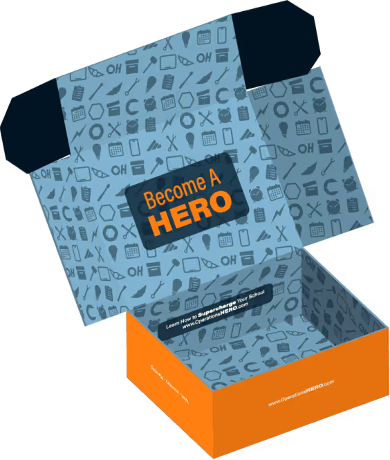
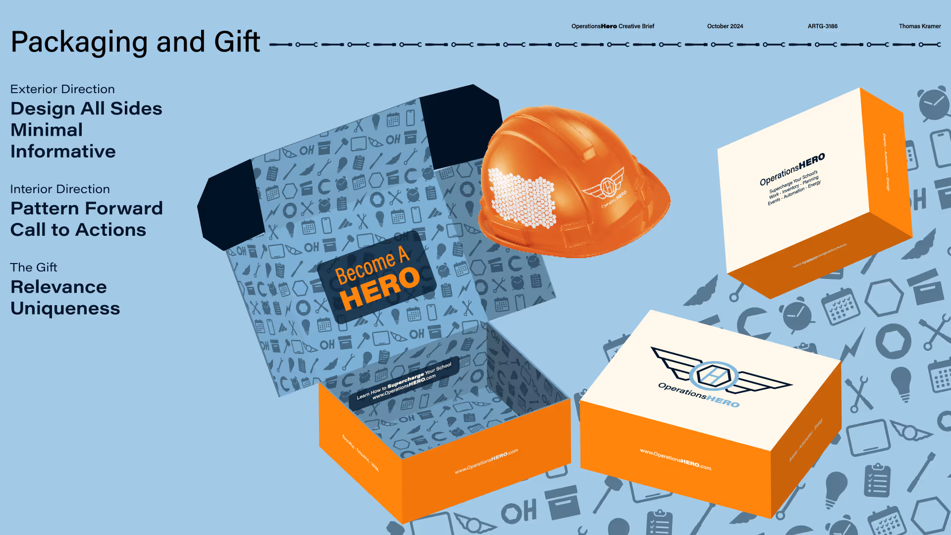
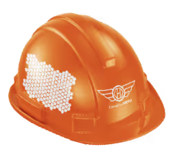
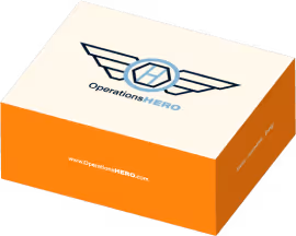
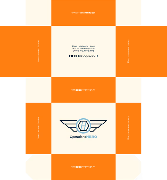
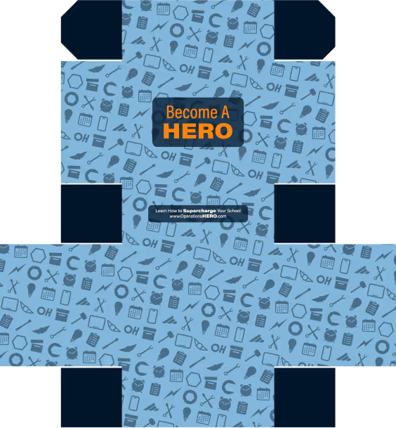
Packaging
Mailer Box & Gift
A custom gift and packaging solution was developed to express appreciation to clients. The fully branded box, UV mapped inside and out, accompanied a branded hard hat designed for maintenance workers.
Direction
Acumin Variable
Aa Bb Cc Dd Ee Ff Gg Hh Ii
Jj Kk Ll Mm Nn Oo Pp Qq Rr
Ss Tt Uu Vv Ww Xx Yy Zz
0 1 2 3 4 5 6 7 8 9
. , : ! ? @ # $ & ( ) -
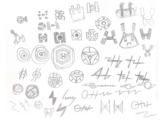
Process
Refining the current brand direction was prioritized over creating a wholly new identity. Dozens of sketches led to a digitized suite of brand assets, with favorite concepts developed further through rounds of feedback. Advertisements were created using Bricklink Studio (a LEGO-focused 3D modeling tool), rendered and edited with Photoshop.


Deliverables
Final deliverables included a pitch deck presentation with the comprehensive brand identity, pattern development, advertising materials, process documentation, icon pack, packaging design, and design rationale. The pitch deck was presented directly to the Chief Marketing Officer of OperationsHERO. View it Here.