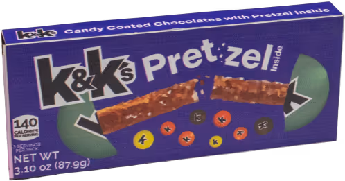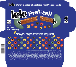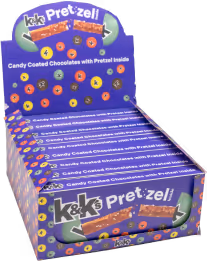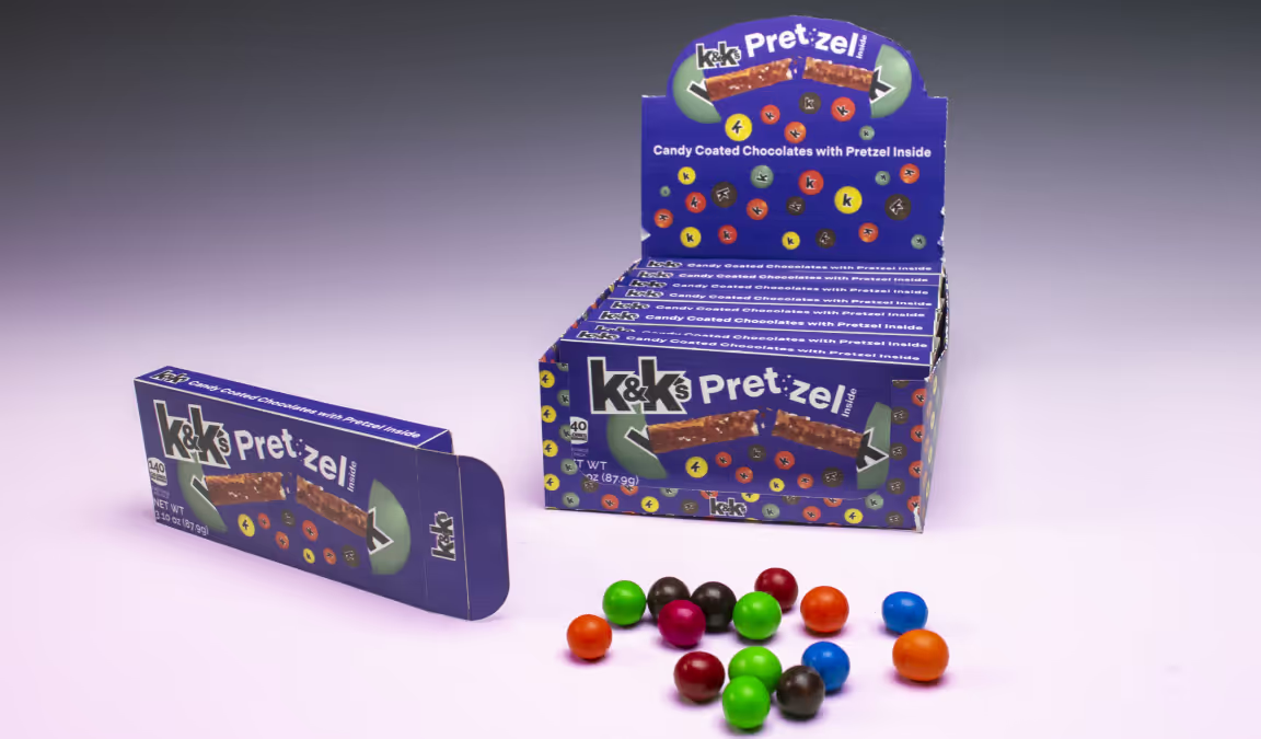
k&k’s Point of Purchase Box
Designed from Apr to May 2025 for Print Production at the University of North Carolina at Charlotte
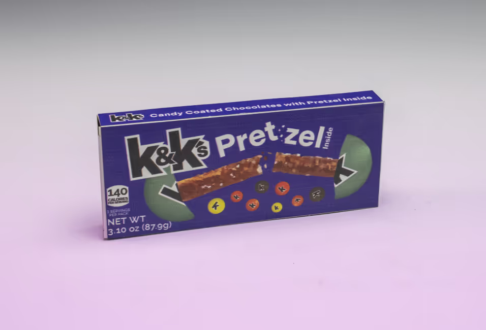
Product Package
Flavor First
Unique flavors highlighted in specific packaging.
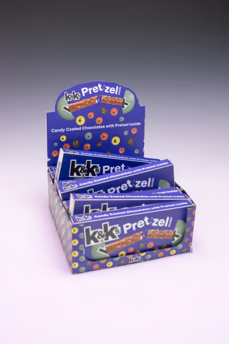
Packaging Design
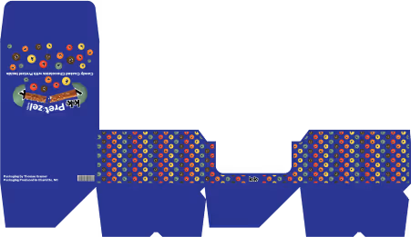
Created was a Point of Purchase box that would stand out amongst the competition on the shelf. Individual product boxes that were striking standalone but cohesive with the primary box were essential to the brand recognition.
Direction
Rebranding a popular product and reimagining its packaging required an extensive and multifaceted approach. Playfulness, coordinated colors, and a celebration of unique flavors formed the core of the new brand direction. With adults as the primary target audience, the visual identity combines bold color choices, sleek typography, and suggestive language to create a more mature brand presence.
Indivisible Bold
Aa Bb Cc Dd Ee Ff Gg Hh Ii
Jj Kk Ll Mm Nn Oo Pp Qq Rr
Ss Tt Uu Vv Ww Xx Yy Zz
0 1 2 3 4 5 6 7 8 9
. , : ! ? @ # $ & ( ) -
Raleway
Aa Bb Cc Dd Ee Ff Gg Hh Ii
Jj Kk Ll Mm Nn Oo Pp Qq Rr
Ss Tt Uu Vv Ww Xx Yy Zz
0 1 2 3 4 5 6 7 8 9
. , : ! ? @ # $ & ( ) -

Process
Typography plays a central role in brand expression, making font selection vital to establishing the desired voice. Indivisible Bold was chosen for the logotype because of its sharp ampersand, strength, and contemporary feel. Raleway serves as the primary typeface, prized for its versatility across multiple weights and its modern, straightforward appearance.

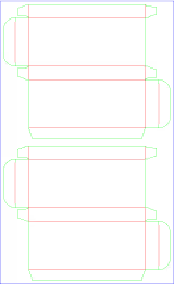
Deliverables
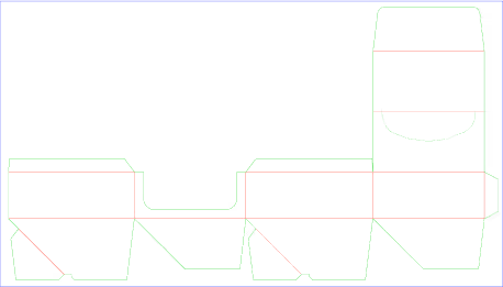
This project generated deliverables spanning a range of media. The process began with the brand redesign, corresponding identity elements, and packaging concepts. Development of print files for laser printing required only minor testing to perfect small details, such as locking flap mechanics. Production and assembly of the point of purchase box and product packaging underwent several iterations to optimize color accuracy and element sizing.